Understanding what Reports are Saying
Quartiles / Boxplots
Some reports include Boxplot charts, which portray a range of statistics visually. Wikipedia does a great job of explaining them in broad terms. However, consider what the following set of boxplots is actually showing you. This is a boxplot of "total value of sales", seperated by different categories
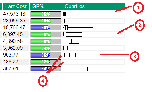
1 This plot shows a range of sale values that go from very low to very high (the ends of the bar are far apart), but the overwhelming average of sales is quite low, as the "box" part of the chart is not large and down at the lower end of the chart.
2 This set of sales is again showing a wide range of value, but is also consistently showing higher value sales, which creates the larger box. However, the line inside the box (which shows the average sale value), is down the lower end. This implies the customer has quite a low average sale value, but also reasonably often makes large sales.
3 The maximum line on this plot is not very high, so this customer has never made any very large purchases, however their average sale is higher than "chart #1" above.
4 Notice on these two plots how the minimum of the lower plot is about the same as the upper plots average. This says the lower plot represents a higher value of sale than the other.
When reading the charts, remember to keep total number of sales in perspective. While plot #1 appears to be mostly small sales, if this plot represents 1,000 sales vs say 60 sales for plot #2, then customer #1 may well be the more profitable
Tip. If you mouse over the boxplot, many reports will provide a tooltip giving you the actual numbers